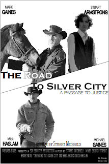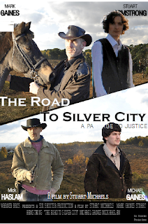

The next two designs have been through much development since the initial design. A few elements remain unchanged but the layout has been somewhat altered. Most alterations were done so to further imitate the existing products that we have viewed and analysed. In the film posters for "The Proposition" and the most recent "3:10 to Yuma" the page was split across the middle, creating a "side" for both "good" and "bad".This is an effective way to portray the morality of the characters, however we felt that the method did not suit the inclusion of four main characters. As each character is as important as the rest we decided not to only show two, but to instead re-think what could be created instead. The design on the left is in black and white with no background image; this particular design was imitating the "3:10 to Yuma" poster in which two main characters were shown in the same manner.
The contrast on the images was increased to create the effect that the location in which the film is set is one of extreme temperatures. The tag line "A passage to justice" presents the idea that justice has been served through journeys before this event, and perhaps foreshadows what is to come. The locations used in the image were done so to imitate the barren lands of the west.The harsh environments affect the clothes they wear, their physical and mental strength and how they will go about completing their task. Obviously well-known for being broken and ridden by cowboys (despite the even longer history Man has had with the animal) the Horse is an important part of any western. They determine the speed at which a task is done and allows the rider to have more energy in the case of a conflict.
The clothes the characters are wearing are perfect for the environment, they keep them cool throughout the day, but warm throughout the cold nights. They also add to the surface realism of the story. The jacket worn by "Jacob Ross" (the outlaw at the bottom right of the colour poster) was hand made to add to the feel of an authentic production. The hats worn protect the characters from the sun or rain, depending on the weather. The land can be heated by the boiling sun one day and the victim of a violent thunder storm the next. Some parts even experience snowfall.
The film title is "The Road to Silver City" it represents the literal journey to Silver City but also has a few other meaning explained elsewhere in the blog. The font is Copperplate Gothic Bold it used occasionally in Westerns/Historical films as it was created around the time. The font is "civilised" with rough edges, this, in a way, represents the land at the time. The contrast between the black and white font was done so to aid in the portraying of both, the "good", and the "bad" forces.
As mentioned in the initial design description, credits are an important element of a film poster. Also mentioned was the fact they are usually placed lower down to ensure the viewer does not get too distracted from looking at the main elements. This is the same reason that condensed font has become a convention; it further isolates them from the rest of the production, and draws the reader's attention away.
It is clear on the film poster that the actor's surnames are in a larger and bolder font than the forenames. This was done for one reason, the fact that a viewer is more likely to recognise an actor from their surname. For example if the viewer read "John" it could be a number of actors with that name. So not only does the method result in the immediate recognition of an actor, but it also prevents confusing between them such as "John Travolta" or "John Wayne".
The iconography of the revolver in the poster represent power and control by force.
This designs have been through much development but still need further change before completion.
No comments:
Post a Comment