Poster Planning and Construction
Monday, 14 March 2011
Monday, 28 February 2011
Poster first draft
 For this design of the film poster we created a simple mock up using the conventions noted from our analysis of existing products, as well as the viewing of other products. It is conventional to have an image cover the majority of the poster, at this stage into the design we were still deciding which image to use.
The credits at the bottom are not just being used as a to follow conventions, but also because those involved have the right to be credited. Although vital they remain at the bottom of the page as it is not as important for the viewers to see them as other elements.
The names of the main actors should be present on the film poster for a few reasons. Firstly for the same reason as the credits; explained above. Another reason is that for a higher budget production it it possible that they may have well-known actors. By printing the names of main actors a viewer may notice that an actor they admire or despise and make the decision of whether to see the film based upon their opinion of the actor. The poster is likely to go through many more production stages before its completion.
Saturday, 26 February 2011
Further designs


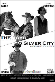
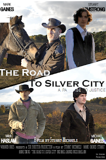
The next two designs have been through much development since the initial design. A few elements remain unchanged but the layout has been somewhat altered. Most alterations were done so to further imitate the existing products that we have viewed and analysed. In the film posters for "The Proposition" and the most recent "3:10 to Yuma" the page was split across the middle, creating a "side" for both "good" and "bad".This is an effective way to portray the morality of the characters, however we felt that the method did not suit the inclusion of four main characters. As each character is as important as the rest we decided not to only show two, but to instead re-think what could be created instead. The design on the left is in black and white with no background image; this particular design was imitating the "3:10 to Yuma" poster in which two main characters were shown in the same manner.
The contrast on the images was increased to create the effect that the location in which the film is set is one of extreme temperatures. The tag line "A passage to justice" presents the idea that justice has been served through journeys before this event, and perhaps foreshadows what is to come. The locations used in the image were done so to imitate the barren lands of the west.The harsh environments affect the clothes they wear, their physical and mental strength and how they will go about completing their task. Obviously well-known for being broken and ridden by cowboys (despite the even longer history Man has had with the animal) the Horse is an important part of any western. They determine the speed at which a task is done and allows the rider to have more energy in the case of a conflict.
The clothes the characters are wearing are perfect for the environment, they keep them cool throughout the day, but warm throughout the cold nights. They also add to the surface realism of the story. The jacket worn by "Jacob Ross" (the outlaw at the bottom right of the colour poster) was hand made to add to the feel of an authentic production. The hats worn protect the characters from the sun or rain, depending on the weather. The land can be heated by the boiling sun one day and the victim of a violent thunder storm the next. Some parts even experience snowfall.
The film title is "The Road to Silver City" it represents the literal journey to Silver City but also has a few other meaning explained elsewhere in the blog. The font is Copperplate Gothic Bold it used occasionally in Westerns/Historical films as it was created around the time. The font is "civilised" with rough edges, this, in a way, represents the land at the time. The contrast between the black and white font was done so to aid in the portraying of both, the "good", and the "bad" forces.
As mentioned in the initial design description, credits are an important element of a film poster. Also mentioned was the fact they are usually placed lower down to ensure the viewer does not get too distracted from looking at the main elements. This is the same reason that condensed font has become a convention; it further isolates them from the rest of the production, and draws the reader's attention away.
It is clear on the film poster that the actor's surnames are in a larger and bolder font than the forenames. This was done for one reason, the fact that a viewer is more likely to recognise an actor from their surname. For example if the viewer read "John" it could be a number of actors with that name. So not only does the method result in the immediate recognition of an actor, but it also prevents confusing between them such as "John Travolta" or "John Wayne".
The iconography of the revolver in the poster represent power and control by force.
This designs have been through much development but still need further change before completion.
Wednesday, 5 January 2011
Final poster design
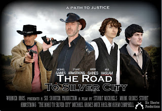
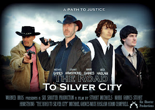
For the final poster design we had to consider what image should be used. We did not have an image of all four actors together in positions that suited the poster so instead we chose to select individual photos and edit them to into the background image. The background image is of a heathland that blends into a woodland. The land in the western and southern states consisted of a number of vast open plains and woodland so the location used for the background image suited the poster. Each image was chosen for a specific purpose. The images of The Stranger (The man in the brown hat and coat) and John Collins (The boy in the white shirt and black waistcoat) were used in the way they were to show how The Stranger is protecting John Collins. He is standing with one foot in front of him to signify his status and role. The revolvers, as previously mentioned, signify power by force.
 The fact that the outlaw to the right (Floyd Harolds) stands revolver drawn and aimed present the idea of him being more hostile than The Stranger who stands relaxed with his revolver resting on his shoulder. All four of the characters are looking into the distance. The outlaw on the right (Jacob Ross) is looking into the distance with a look of determination. This was to represent how he is determined to find the person he has been asked to kill and will not let anyone stop him from doing this (The Stranger).
  The difference in the colour of the text used in the film title depicts the good and bad and the theme of morality in the film. For the above design we desaturated the image to create more of a gritty effect, however for the final poster we chose to use a blue tint to reflect the vibrance and high contrast of the landscape. (The poster on the left)
We used a vignette on the poster to portray the idea that despite there being light in the time and place, there is an element of darkness surrounding those in the light.
The final poster uses a number of the ideas explained in other designs but overall has a slightly different effect.

Subscribe to:
Posts (Atom)
